5 Car Brand Logos With Hidden Meanings You Never Knew
By Adam Chehayeb
Ever wondered about the secrets behind your favorite car brand's badge? Dive into the fascinating stories, histories, and clever symbolism hidden in plain sight.
Unlocking the Secrets Behind Car Brand Logos
When you think about what goes into a car, your mind probably jumps to powerful engines, sleek design, cutting-edge safety features, or innovative technology. And you'd be right! Car manufacturers genuinely obsess over every single detail. But there's one small yet mighty detail that often gets overlooked, yet holds a surprising amount of creativity and history: the brand logo.
A brand's emblem is usually the very first visual connection buyers make with a vehicle. It's the badge of honor on the grille, the signature on the steering wheel, and the defining mark of an automaker's identity. So, it's no shock that these little symbols are packed with astonishing symbolism and fascinating stories, often hidden in plain sight.
Sure, some logos are pretty straightforward. Take Ford, for instance; its famous blue oval simply features the founder's last name in a distinctive typeface. Simple, classic, effective. But for other brands, their logos are like intricate puzzles, hiding entire sagas, legendary histories, or clever secrets that make you say, "Wow, I never knew that!" If you've ever found yourself pondering why Audi sports four interlocked rings or why Cadillac's early badges featured mythical birds you've likely never heard of, then you're in for a treat. Buckle up, because we're about to explore five car brand logos with truly captivating hidden meanings that you probably never knew.
1. Cadillac: A Royal Shield With Layers of Symbolism
Let's kick things off with Cadillac, a brand synonymous with American luxury and innovation. While today's Cadillac logo is sleek and modern, its journey through countless evolutions over the last century reveals that its earliest version was arguably the most intricate and deeply meaningful. This magnificent emblem directly traces its roots back to the aristocratic coat of arms of Antoine de la Mothe, Sieur de Cadillac – the revered French explorer who founded the vibrant city of Detroit. Early iterations of the Cadillac badge were incredibly detailed, showcasing a regal crown, a complex crest, tiny mythical birds known as merlettes, and elaborate color patterns, each carrying significant weight.
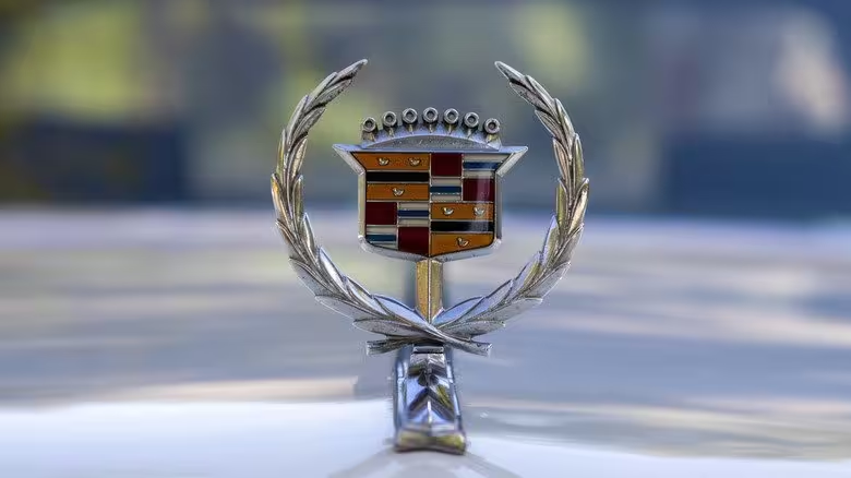
Each element within that original crest was chosen for a specific symbolic reason:
While today’s modern Cadillac logo has adopted a cleaner, more minimal aesthetic, shedding some of the ornate details, its foundational roots remain profoundly connected to this rich, aristocratic history. It’s a subtle nod to a grand past, even in its simplified form.
2. Audi: Four Rings, Four Manufacturers, One Union
The Audi logo is undeniably one of the most recognizable in the automotive world, and once you know its fascinating backstory, it becomes incredibly easy to interpret. Those iconic four interlocked rings aren't just a stylish design; they date all the way back to 1932, a pivotal year when four distinct German manufacturers – Audi, DKW, Horch, and Wanderer – made the strategic decision to merge, forming what would become Auto Union AG. Each individual ring in the emblem proudly represents one of those pioneering founding brands, a testament to their enduring union.
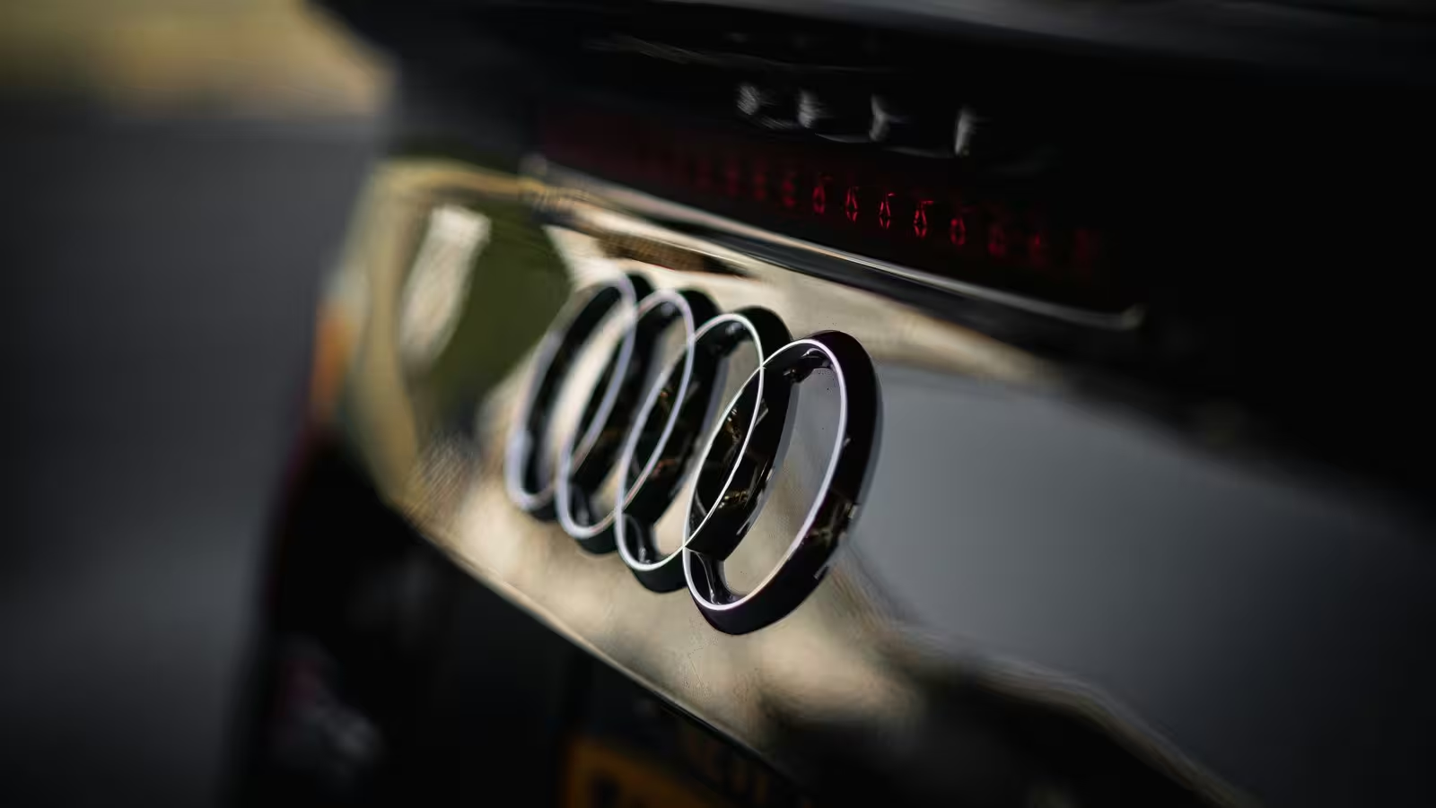
But the symbolism goes even deeper, with each ring also representing a unique characteristic that those brands brought to the table:
So, while the modern Audi logo might strike you as elegantly simple with its clean, interlocking circles, it actually carries nearly a century of rich heritage, collaborative spirit, and distinct brand identities within its design. It's a powerful visual reminder of unity and collective strength.
3. Hyundai: A Handshake Hidden in an “H”
At first glance, the Hyundai badge appears to be nothing more than a stylish, tilted letter H, and in a literal sense, that's exactly what it is. However, like many great designs, there's a much deeper and more thoughtful meaning cleverly embedded within its seemingly simple shape. This isn't just an 'H' for Hyundai; it tells a story of connection.
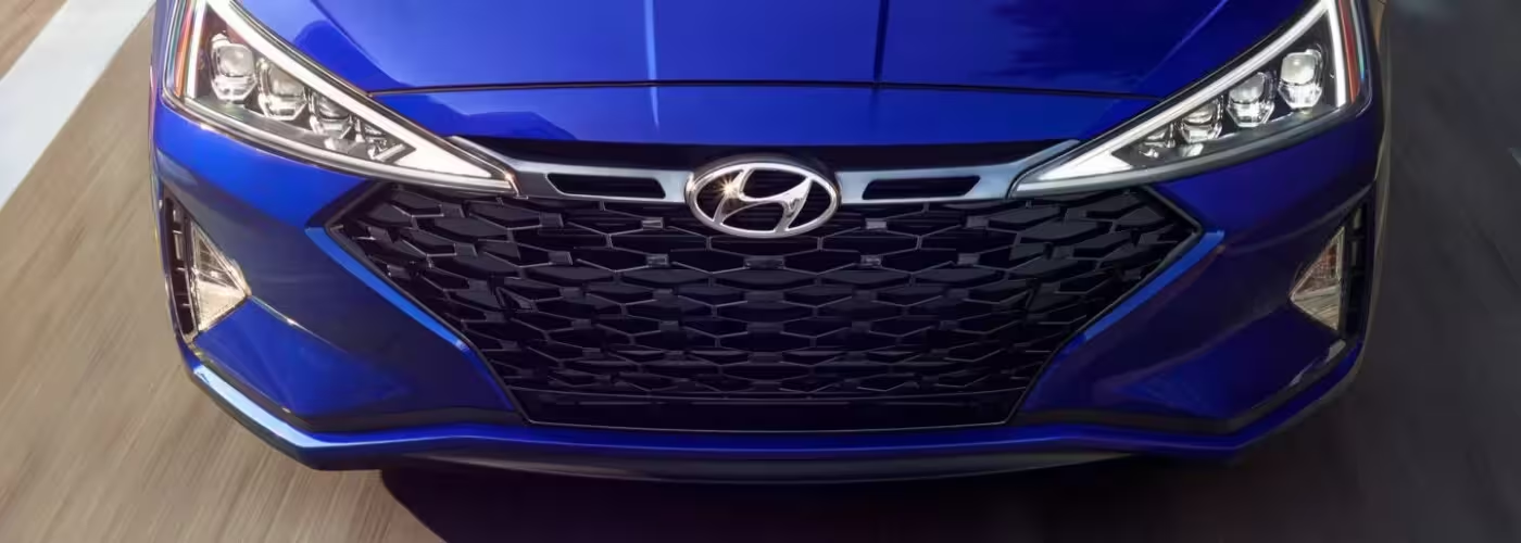
If you take a closer look and let your imagination connect the dots, you’ll actually discern two figures engaged in a firm handshake. This subtle yet powerful visual represents a crucial relationship for the brand:
This thoughtful design is a symbolic nod to core values like trust, partnership, and the cultivation of long-term customer relationships. These very principles have been instrumental in Hyundai’s remarkable journey, transforming it from a brand once known primarily for budget-friendly vehicles into a formidable global automotive leader, celebrated for its advanced EVs and trendsetting technology.
Fun fact: The name Hyundai itself means “modern” in Korean. How fitting for a brand that consistently pushes boundaries with innovative electric vehicles and cutting-edge technology!
4. Lamborghini: A Zodiac Animal Charging Forward
Few automotive emblems command as much attention and raw power as Lamborghini’s iconic raging bull. It’s an unmistakable symbol of strength and aggression, but the story behind its creation is surprisingly personal and deeply rooted in the founder’s character. Ferruccio Lamborghini, the visionary behind the legendary supercars, was born under the zodiac sign Taurus, which is, of course, represented by the bull.
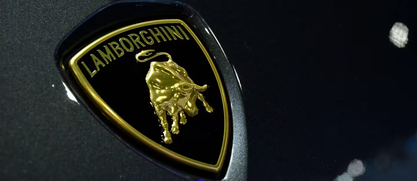
Ferruccio greatly admired the qualities associated with the bull: its immense strength, undeniable power, and unyielding determination. These were precisely the characteristics he wanted to see reflected in every single car he built. Beyond his zodiac connection, the bull’s aggressive stance perfectly mirrored Ferruccio’s own bold and fiery personality, especially during his infamous rivalry with Enzo Ferrari.
Legend has it that after being somewhat dismissively told by Enzo Ferrari to stick to tractors when he complained about a faulty clutch in his Ferrari, Ferruccio was spurred by a fierce desire to prove him wrong. He famously set out to build a superior sports car, one that would challenge the established order and become an automotive icon in its own right. The raging bull, with its untamed spirit and formidable presence, became the ultimate symbol for that ambition, defiance, and unwavering drive. It's not just a logo; it's a declaration.
5. Toyota: Three Ovals, One Global Identity
Toyota’s modern logo, a sleek and sophisticated design, was first unveiled in 1989 to commemorate the company’s 50th anniversary. While it might appear deceptively simple at first glance, like many of the best logos, it’s actually brimming with layers of thoughtful symbolism and clever design elements. It's a testament to how much meaning can be packed into minimalist aesthetics.
The emblem features three distinct, interconnected ovals that work together to convey a powerful message:
But there’s an even cleverer detail: if you tilt the inner shapes ever so slightly, you’ll notice that they also cleverly form a stylized letter “T” – a subtle yet unmistakable nod to the brand’s name. This ingenious design allows the logo to convey multiple meanings simultaneously, adding depth to its clean lines.
Beyond its symbolic depth, the Toyota logo is also a marvel of practical design. It’s perfectly symmetrical horizontally, which means it’s easily recognizable and legible from any angle. Whether you see it proudly displayed on a car’s grille approaching you, or subtly reflected in your rearview mirror, its clarity and iconic shape remain consistent. It’s a truly versatile and meaningful emblem.
Final Thoughts: More Than Just a Badge
As we've explored, car logos are far more than just decorative badges slapped onto a vehicle. Whether their origins are rooted in deeply personal stories, rich cultural symbols, or historic industrial alliances, these emblems are powerful visual summaries. They encapsulate the core values, significant histories, and ambitious aspirations that have profoundly shaped each brand over decades, or even a century.
The next time you spot a familiar car logo, take a moment to look beyond the surface. You might just discover a hidden world of meaning and a fascinating story waiting to be told. It’s incredible how much history and vision can be distilled into such a small, iconic design!
At Automax®, we absolutely love uncovering these kinds of captivating stories behind the cars you adore. We believe that understanding a brand's heritage makes the driving experience even richer. And when you're ready to find the next vehicle that inspires you, whether it's for its hidden symbolism or its cutting-edge performance, we're here to help you discover the perfect match.